
%402x.svg)
Beige is Dead: Why “Clean Girl” Aesthetics Are Killing Your Wellness Business
Scroll through Instagram. Open five wellness websites. Click on three coaches’ brand decks.
Chances are, they all look eerily similar.
Beige backgrounds. Soft neutrals. Thin sans serif fonts. A vague promise of “alignment,” “ease,” or “elevated living.” Everything is clean, calm, and carefully inoffensive. And that’s exactly the problem.
What once felt refined now feels repetitive. What once signaled trust now signals sameness. The “clean girl” aesthetic, borrowed from lifestyle influencers and copied endlessly across the wellness industry, has gone from aspirational to invisible.
This isn’t a design critique for the sake of taste, it’s a business problem.
When every wellness brand looks the same, none of them stand out. When visuals are stripped of personality, story, and texture, they stop communicating value. And when brands prioritize looking “safe” over being distinctive, they quietly train clients to see their work as interchangeable.
Affluent clients aren’t drawn to clean aesthetics; they’re drawn to meaning, depth, and identity. They don’t buy beige. They buy brands that feel alive, brands that stand for something and can’t be confused with anyone else.
As we move into 2026 and beyond, the wellness brands that continue to hide behind minimalism won’t just look outdated. They’ll be left behind.
Because beige isn’t timeless anymore, it’s forgettable.
.png)
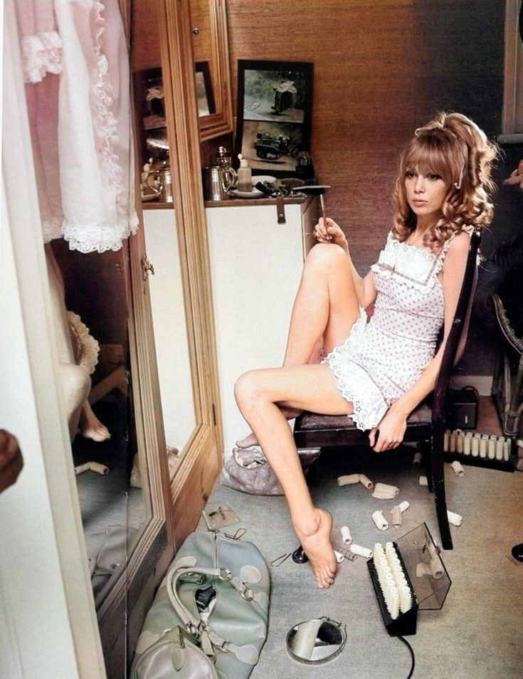
The Rise—and Oversaturation—of the “Clean Girl” Look
Minimalism did not become dominant by accident. Clean design emerged as a corrective response to visual chaos. Websites were cluttered and marketing was loud and aggressive. Wellness, in particular, was trying to distance itself from anything that felt unregulated, gimmicky, or overwhelming. Clean design offered relief. It created breathing room, and it signaled care.
In that context, minimalism worked. Neutral palettes suggested safety. Simple layouts implied order. White space communicated restraint. For a growing wellness audience seeking grounding and trust, the aesthetic felt reassuring rather than empty.
But design languages do not remain neutral forever.
Once an aesthetic becomes widely adopted, it stops functioning as a signal and starts functioning as a default. As more wellness brands entered the market, minimalism shifted from a thoughtful choice into a visual requirement. Looking “clean” became synonymous with looking legitimate. Few founders questioned the look because deviating from it felt risky.
What began as a response to excess slowly became a form of visual conformity. Instead of communicating intention, branding began communicating compliance. The aesthetic no longer reflected values or philosophy. It reflected participation.
How Instagram, TikTok, and DTC Culture Flattened Brand Identity
Social platforms accelerated this shift with precision. Algorithms reward what feels familiar because familiarity performs. Visuals that blend seamlessly into feeds are easier to consume, easier to like, and easier to replicate. Over time, wellness brands learned what worked and repeated it, often without asking why.
Instagram normalized polished neutrality. TikTok normalized rapid trend adoption. What gained traction was copied quickly, then copied again. Visual mimicry became part of the ecosystem. Originality required patience. Replication delivered faster results.
Direct to consumer culture reinforced the pattern. Clean packaging photographed well. Neutral feeds converted consistently. Templates promised speed and polish without friction. Brand identity became something to assemble rather than something to define.
The result was a monoculture. An aesthetic loop where sameness passed for credibility and distinction felt unnecessary. Entire categories of wellness brands began to look interchangeable before a single word was read.
.png)
Beige, Sans Serif, Minimal. When Trends Become Traps
Beige is not the problem. Minimalism is not the villain. The issue is unquestioned adoption.
When founders default to soft neutrals because they feel “safe,” modern sans serif fonts because they look “clean,” and generous white space because it reads as “luxury,” the choice stops being strategic. It becomes automatic.
Automatic branding avoids risk, but it also avoids identity.
Without intention, these elements lose their ability to communicate meaning. Instead of expressing values or perspective, they blur together. Brands become harder to recognize, harder to remember, and harder to distinguish.
A trend becomes a trap the moment it replaces thinking.
Why “Clean” No Longer Signals Luxury or Trust
There remains a strong belief in wellness that neutrality equals professionalism. That removing personality makes a brand feel more credible. That playing it safe earns trust.
In 2026, this belief no longer holds.
Sophisticated buyers have seen this aesthetic too many times. Clean presentation without depth now reads as generic rather than refined. Trust has shifted away from surface polish and toward coherence, clarity, and intention.
Luxury no longer lives in restraint alone. It lives in specificity.
Luxury Brand Identity Is About Emotion, Not Absence
Luxury has never been about emptiness for its own sake. It has always been about meaning. About choice. About the feeling created through detail, texture, and intention.
High end brands understand that desire is emotional rather than rational. People respond to what feels considered. Feeling requires more than neutral space. It requires contrast. It requires story. It requires a point of view.
A brand that feels sterile does not feel elevated. It feels cautious. And caution rarely creates longing.
The Psychological Cost of Playing It Safe
When everything looks calm, nothing stands out.
From a psychological standpoint, memory is built through contrast and narrative. The brain remembers what feels distinct, not what feels familiar. Brands that avoid edges avoid memorability. Over time, this weakens preference and erodes trust.
Safe brands rarely offend, but they also rarely linger. In an industry built on perception and connection, being forgettable is a liability.
Minimalism without identity does not protect a brand. It quietly limits how far it can go.
.png)
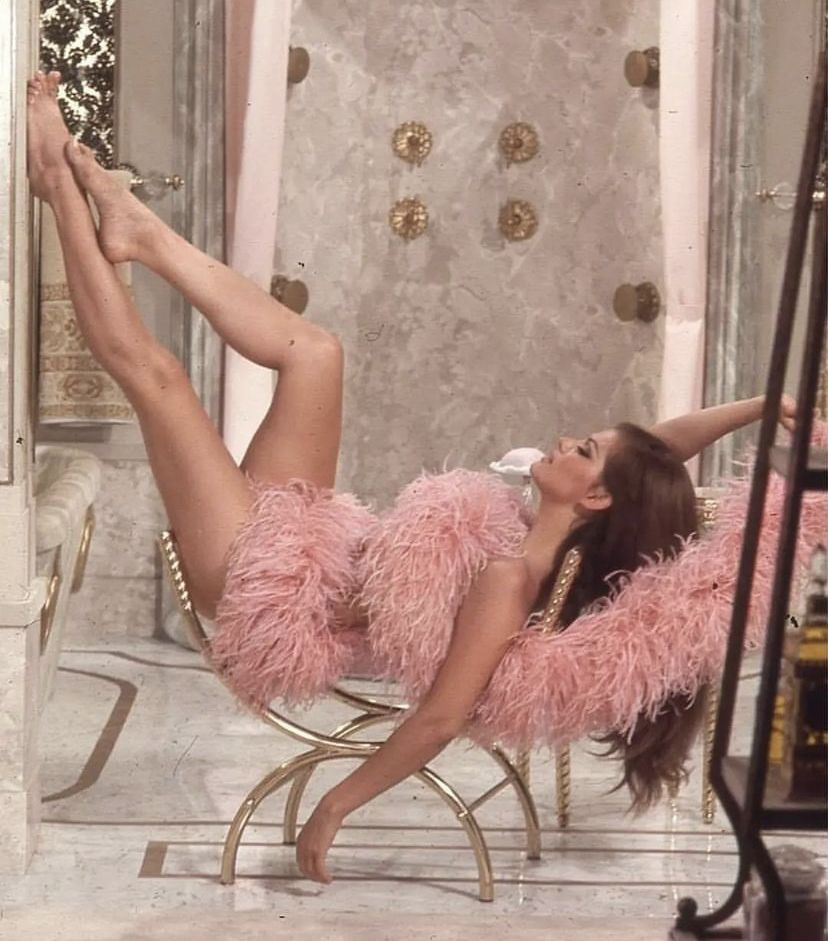
Wellness Branding Trends 2026: From Sterile to Sensory
Wellness branding is entering a different phase, and it has less to do with what looks clean and more to do with what feels real. As audiences become more visually literate and more emotionally discerning, sterile presentation no longer satisfies. In 2026, brands are being evaluated not only on clarity, but on depth. Not only on polish, but on presence.
The shift underway is subtle but decisive. Wellness brands are moving away from flat, neutral expression and toward experiences that feel layered, human, and intentional. This does not mean chaos or excess. It means richness. It means design that communicates something beyond surface calm, something that invites curiosity and connection.
What replaces beige is not noise. It is nuance.
Texture and Sensory Depth: What’s Replacing Flat, Beige Design
Flat design had its moment. It was efficient, legible, and easy to reproduce across platforms. In 2026, efficiency alone no longer feels sufficient.
Texture is returning, both visually and emotionally. Color palettes are expanding beyond muted neutrals into richer, more dimensional tones. Typography is becoming more expressive. Layouts feel layered rather than sparse. Visual systems are designed to be felt, not simply scanned.
This shift reflects how people want to experience wellness now. After years of abstraction, audiences are craving grounding. Texture creates warmth. Contrast creates interest. Depth creates trust. A brand that feels dimensional feels considered. It suggests presence rather than performance.
The move toward sensory depth is not about decoration. It is about signaling care through detail.
Narrative Driven Identity: Why Story Will Outperform Aesthetics
In 2026, aesthetics without story struggle to hold attention. Wellness brands built on visual appeal alone often peak quickly, then fade as soon as the next trend arrives. Brands rooted in narrative endure.
Story creates context. It explains why a brand exists, how it sees the world, and what it believes about transformation. When identity is driven by narrative, design choices feel intentional rather than borrowed. Visuals stop being decorative and start becoming expressive.
Brands with a clear philosophy communicate confidence. They feel grounded. They invite alignment rather than approval. In a crowded market, story provides structure. It gives audiences something to recognize and return to.
Post 2026, the brands that stand out will not be the ones with the cleanest feeds. They will be the ones with the clearest point of view.
Multi Sensory Branding: How Wellness Brands Will Be Felt, Not Just Seen
Wellness branding is expanding beyond static visuals into experience. In 2026, identity extends into motion, sound, interaction, and pacing. Brands are no longer confined to what appears on a homepage. They live in how they move, how they speak, and how they engage.
Subtle animation creates rhythm. Sound design adds intimacy. Interactive elements invite participation. Even the cadence of language contributes to how a brand is perceived. These layers work together to create presence.
This shift mirrors how people experience wellness in real life. It is not just visual. It is physical, emotional, and sensory. Brands that reflect this complexity feel more aligned with the work they offer.
A brand that can be felt creates a deeper impression than one that is simply seen.
.png)
The Myth of “Clean” Clients vs. the Reality of Affluent Buyers
There is a persistent idea in wellness that clients want neutrality, that clean presentation feels more trustworthy, and that restraint attracts higher end buyers. This assumption is understandable, but incomplete.
Affluent clients are not drawn to sameness. They are drawn to meaning. Their decisions are guided by resonance, identity, and coherence. They notice detail. They sense intention. They respond to brands that feel self assured rather than cautious.
Clean presentation without depth often reads as generic to sophisticated buyers. What feels safe to the founder may feel interchangeable to the client.
Affluent Clients Buy Narrative, Not Neutrality
High value purchases are rarely logical. They are emotional decisions supported by rationale. Affluent clients invest in brands that reflect how they see themselves or how they want to live.
Narrative provides that mirror. It communicates values, worldview, and direction. Neutral aesthetics without story fail to create this connection. They offer calm without context.
When a brand expresses belief, clients feel oriented. They understand what they are buying into, not just what they are buying. This clarity builds trust more effectively than restraint alone.
Why High Ticket Wellness Requires Identity, Not Aesthetic Trends
High ticket wellness businesses are not built on trends. They are built on authority, consistency, and perception. Identity anchors all three.
Brands that rely on aesthetic trends remain vulnerable to saturation. As soon as the look becomes common, differentiation disappears. Identity, on the other hand, compounds. It deepens over time. It creates recognition.
In 2026, pricing power belongs to brands that feel grounded in who they are, not brands that chase what looks current. A strong identity supports premium positioning because it communicates confidence, clarity, and purpose.
Wellness branding is no longer about looking clean. It is about feeling real.
Standing Out as a Wellness Entrepreneur in a Sea of Sameness
At some point, most wellness entrepreneurs reach the same quiet frustration. The work feels meaningful. The results are real. The transformation clients experience is profound. Yet the brand does not reflect any of that depth. From the outside, it blends in.
This disconnect is not personal failure. It is structural.
Wellness branding has become so template driven that individuality is often the first thing sacrificed in the name of polish. Standing out now requires more than good intentions and clean visuals. It requires clarity about who you are, what you stand for, and why your work exists in the first place.
Why Personal Brands Are Being Erased by Template Design
Templates promise efficiency, brand kits promise cohesion, Canva promises ease. None of these tools are inherently wrong, but they become problematic when they replace thinking.
When dozens of wellness entrepreneurs start from the same layouts, fonts, and color palettes, personal brands lose their edges. Visual identity becomes generic before the story is even told. What looks professional on day one looks interchangeable by month six.
The danger is subtle. Template based branding feels productive, but it often erases the very qualities clients are drawn to, lived experience, perspective, and worldview. When everyone uses the same visual language, differentiation disappears long before competition becomes obvious.
Personal brands are not meant to be assembled. They are meant to be articulated.
Positioning vs. Aesthetics. What Actually Differentiates You
Aesthetics are not the same as positioning, though they are often treated as interchangeable. Aesthetics describe how something looks. Positioning defines how something is perceived.
Positioning answers harder questions. Who is this for. What does it challenge. What does it refuse. What does it prioritize. Without answers to those questions, visual identity floats without anchor.
Strong brands do not start with color palettes. They start with clarity. Aesthetics then support that clarity. When the order is reversed, branding becomes decorative rather than directional.
Differentiation comes from perspective, not polish.
What to Do Instead. Building a Distinctive Wellness Brand
Moving beyond beige does not require abandoning refinement. It requires commitment. Commitment to meaning, specificity, and intentional expression.
A distinctive brand feels grounded because it is built from the inside out. Visuals follow values. Design supports belief. Nothing is random, and nothing exists only because it looks good.
This is where leadership replaces trend following.
Audit Your Brand for Depth, Texture, and Meaning
A useful place to start is not with redesign, but with reflection.
Ask where your brand feels thin. Where visuals feel safe rather than expressive. Where language sounds pleasant but unspecific. These are often signs of identity being muted rather than clarified.
Depth comes from alignment. Texture comes from detail. Meaning comes from choice. When branding reflects lived experience and point of view, it gains weight without needing to shout.
A brand audit focused on feeling rather than appearance reveals far more than a mood board ever could.
Design Questions That Attract Premium Clients
Premium clients respond to intention. Before making another design decision, it helps to ask questions that shift focus away from trends and toward perception.
• What should someone feel after spending five minutes with this brand?
• What belief does this brand express without explaining?
• What makes this work distinct beyond credentials or modality?
• What would feel lost if this brand disappeared tomorrow?
Design that answers these questions communicates confidence. Confidence attracts investment.
Beige Isn’t Safe. It’s Invisible.
Beige feels safe because it avoids reaction. The problem is that it also avoids recognition.
In an industry built on trust, connection, and transformation, invisibility is not neutral. It is limiting. Brands that blend in are easier to overlook, easier to forget, and easier to replace.
Standing out does not require being loud. It requires being clear.
Clean Is Easy. Memorable Is Profitable.
Clean branding is accessible. Memorable branding is intentional.
As wellness branding moves into 2026 and beyond, the brands that grow are not the ones that follow aesthetics most closely. They are the ones that know who they are and express it consistently, confidently, and without apology.
Beige will always be available.
Identity is what creates value.
Frequently Asked Questions
Is the “clean girl” aesthetic bad for wellness branding?
The clean girl aesthetic is not inherently bad, but it has become overused. In wellness branding, widespread adoption has stripped it of meaning. What once signaled care and credibility now often signals sameness. For brands trying to stand out or attract premium clients, relying on this aesthetic alone can limit differentiation and perceived value.
What are the biggest wellness branding trends for 2026?
Wellness branding trends for 2026 are shifting away from sterile minimalism and toward sensory depth, narrative driven identity, and multi sensory experiences. Brands are focusing more on texture, story, emotional resonance, and presence rather than flat visuals and neutral palettes.
How do I stand out as a wellness entrepreneur in a crowded market?
Standing out as a wellness entrepreneur requires clarity of identity rather than adherence to aesthetic trends. Brands that differentiate successfully articulate a clear point of view, express lived experience, and build visual systems around meaning rather than templates or default design choices.
Why does beige branding feel so common in wellness businesses?
Beige branding became common because it photographs well, feels safe, and was widely associated with professionalism during the early growth of the wellness industry. Over time, social media algorithms, brand templates, and direct to consumer culture reinforced this look, creating visual uniformity across the space.
Do affluent clients prefer minimalist branding?
Affluent clients tend to prioritize meaning, coherence, and intention over minimalism alone. While clean design can still play a role, high value buyers are more responsive to brands with depth, narrative, and a clear identity. Neutral aesthetics without story often feel generic rather than premium.
What makes a wellness brand feel luxurious?
A wellness brand feels luxurious when it communicates intention, emotional resonance, and confidence. Luxury branding is less about removing elements and more about choosing them deliberately. Texture, contrast, storytelling, and sensory experience all contribute to a perception of value and authority.
How do I know if my brand looks interchangeable?
If your brand relies heavily on neutral colors, generic language, common fonts, and template based layouts, and if it could easily be mistaken for another wellness business, it may be blending in. Interchangeable brands often feel pleasant but forgettable, which makes growth and premium positioning harder over time.
Should I rebrand if my wellness business looks too minimal?
Rebranding is not always necessary. Many brands benefit more from refining their identity, clarifying their narrative, and adding depth to their existing visual system. The goal is not to abandon refinement, but to ensure design choices are intentional and expressive rather than automatic.
__________________________________________
Found this helpful? Pin it to your board so you can revisit these tips anytime! 📌
.png)


