%402x.svg)
Brand Icon or Wordmark? Logo Clarity for Women-Led Wellness Brands
Why Your Logo Style Matters in Wellness Branding
Your logo is often the first visual impression of your business. Before someone joins your class, attends a session, or purchases a product, they see the symbol or name representing your work. That first impression shapes expectations.
For therapists, coaches, and wellness practitioners, a logo holds meaning beyond design. It communicates presence, care, and intention. A wordmark highlights your name and centers your professional identity. A brand icon uses imagery to signal recognition and symbolic connection. Each approach supports different business goals, and both guide how clients feel when they encounter your brand.
Branding in wellness requires thoughtful attention because clients are seeking trust and alignment. They want to know they are in a safe and supportive space. The way your logo looks and feels is part of how that trust begins.
This article explores the two primary logo styles—wordmark and brand icon—and helps you understand which one fits your practice. You will see how each works, how people respond, and how to decide which direction matches your stage of business and your vision for growth.
What’s the Difference Between a Wordmark and a Brand Icon
When choosing a logo, most businesses work with either a wordmark or a brand icon. These are the two most common approaches, and each creates a different experience for your audience.
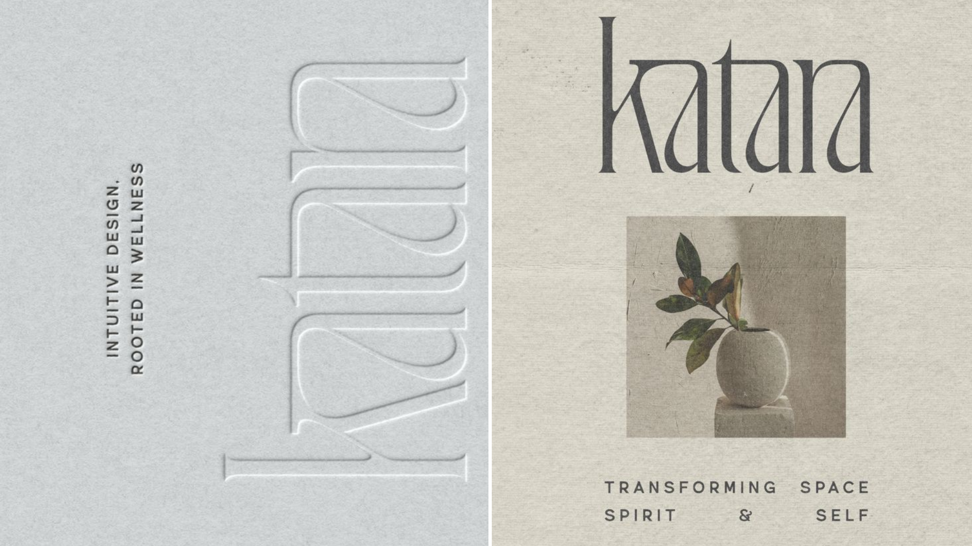
Wordmark
A wordmark is your business name presented in a distinct typeface. There is no separate symbol. Recognition comes from the name itself, supported by consistent design.
Examples of wordmarks:
- Google uses its name in bold, colorful letters.
- Coca-Cola relies on its flowing red script.
- Goop uses a simple serif font as its logo.
When wordmarks are most effective:
- Your name is central to your work, such as a therapist or coach.
- You are at an early stage and want to keep your identity clear and professional.
- You want people to connect directly with your name rather than with a symbol.
Emotional outcomes:
- Clients remember your name easily.
- A clear wordmark signals confidence, professionalism, and consistency.
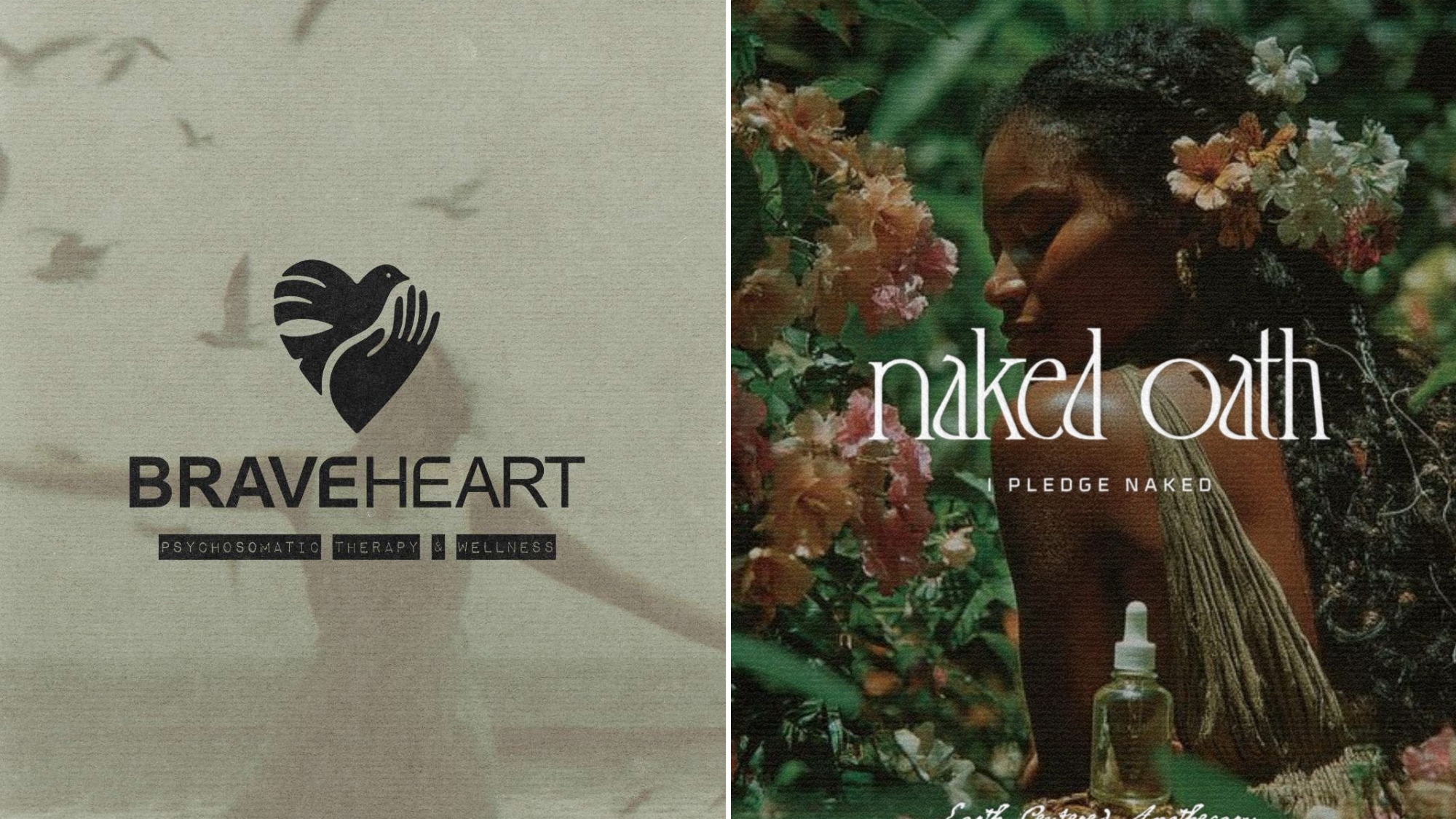
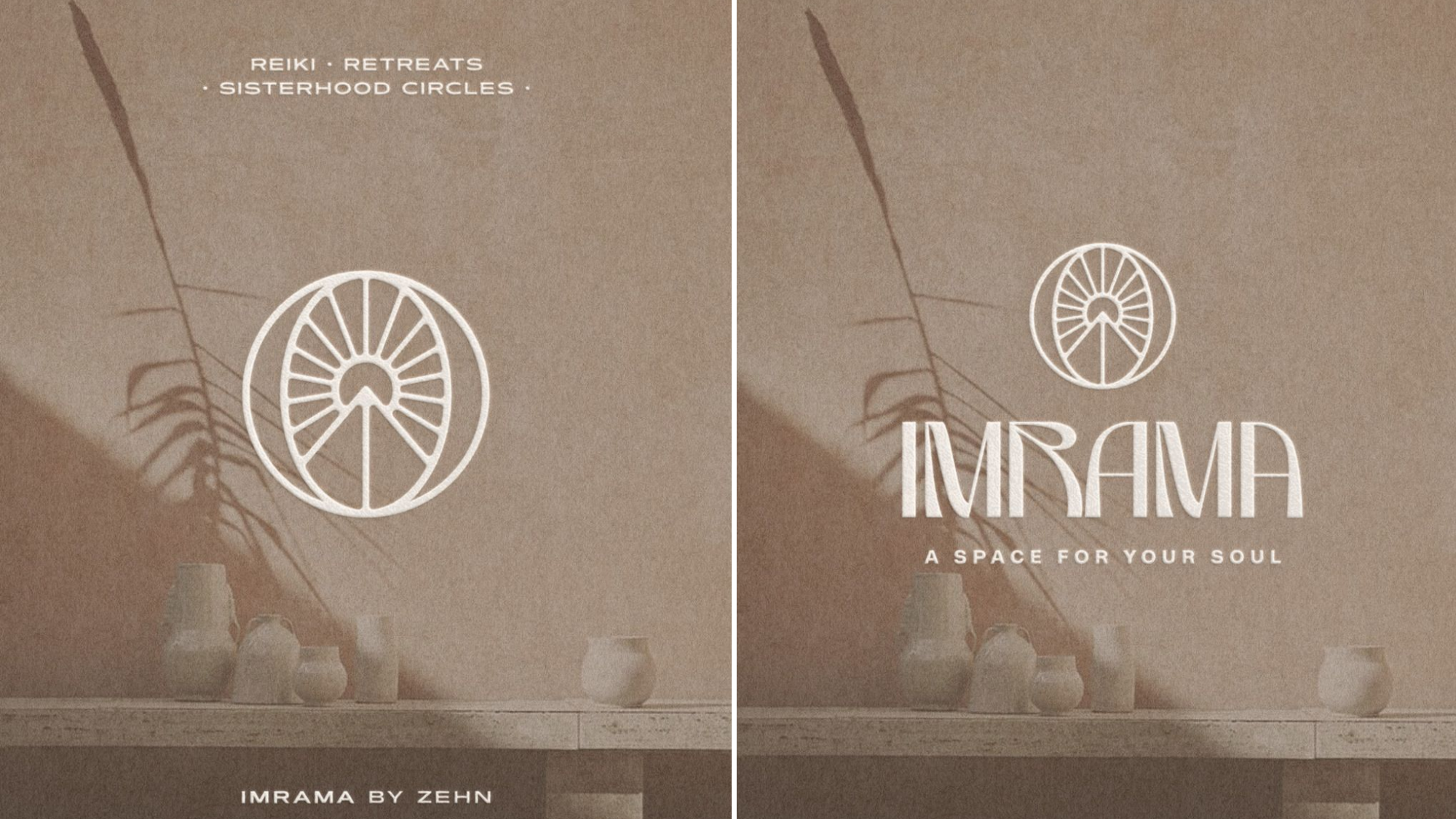
Brand Icon
A brand icon is a symbol that represents your business. It can be abstract, geometric, or representational. The symbol might appear with the name or on its own once recognition is strong.
Examples of brand icons:
- Instagram’s multicolored camera shape.
- Apple’s minimalist apple symbol.
- Twitter’s bird (now known as X, though the bird remains widely recognized).
When brand icons are most effective:
- Your business spans multiple offerings or products.
- You want a logo that works well in small spaces like app icons or packaging.
- You want your brand associated with a visual symbol that carries meaning or presence.
Emotional outcomes:
- Clients feel connected to the symbol itself, which can hold emotional or cultural meaning.
- The icon allows for immediate recognition without words.
How Your Audience Responds to Visual Branding
Logos do more than identify a business. They influence how people feel before they read a single word. For therapists, coaches, and wellness professionals, this emotional response matters deeply. Clients are looking for a sense of trust, care, and alignment. The style of your logo plays a role in creating that connection.
First Impressions
Research on branding shows that people form opinions about a business in seconds. A clear wordmark gives a straightforward impression. It tells your audience, “This is who I am, and you can rely on me.” An icon, on the other hand, signals imagery and story. It can make your brand memorable through association with a symbol.
Think of Google’s wordmark. Its clean design and bright colors communicate openness and accessibility. Now think of Instagram’s camera icon. Even without words, people know what it represents. Each approach is effective, but they communicate different qualities.
Emotional Alignment
In wellness and healing, emotional clarity is essential. A therapist’s wordmark logo communicates stability and professionalism. Clients see the name and know exactly who they are meeting. For a wellness brand offering products or group programs, an icon helps carry a sense of vision and identity beyond one person. A circle, a plant, or a symbolic image can resonate with the values of community, growth, or healing.
Holding Space Through Design
Your visual identity is part of the environment you create for clients. The logo becomes a touchpoint that sets expectations. A balanced wordmark communicates calm and reliability. A meaningful symbol offers inspiration and belonging. The right choice depends on how you want people to feel before they step into your practice, purchase your product, or engage with your community.
When to Choose a Wordmark
A wordmark places your name front and center. For many therapists, coaches, and spiritual wellness practitioners, this is often the most supportive choice in the early stages of business. It creates clarity, builds recognition, and keeps the focus on you as the guide.
Signs a Wordmark Fits Your Practice
- Your personal name is central to your work. If clients are booking sessions with you, not a larger team, your name holds the brand.
- You are in the beginning stages of your practice and need a professional identity that is simple and consistent.
- You prefer a minimal, clean look that communicates steadiness and accessibility.
- You are not creating product packaging, merchandise, or apps that would require a symbol.
Emotional Outcomes
A wordmark helps clients feel they are connecting directly with you. They see your name clearly, and that name becomes associated with safety, trust, and care. For people entering therapy, coaching, or spiritual guidance, this directness can feel grounding.
Think of Google. The wordmark alone carries the identity of the company. The colors are playful, but the focus is on the name. For a wellness practitioner, a wordmark serves a similar purpose. It places your name in a consistent, professional presentation, which builds recognition and confidence over time.
When to Choose a Brand Icon
A brand icon becomes helpful when your work grows beyond a personal practice or when you want to create instant recognition across platforms and products. Icons work as visual shorthand, offering people a way to recognize your brand even before they read your name.
Signs a Brand Icon Fits Your Practice
- You are developing products such as essential oils, card decks, or wellness merchandise.
- You are building a group practice or collective where the brand identity goes beyond one person’s name.
- You are active on visual platforms such as Instagram or Pinterest where an image stands out more than text.
- Your brand name is long, complex, or not easily displayed in small formats, so a symbol simplifies recognition.
- You want a logo that carries symbolic meaning aligned with your mission or values.
Emotional Outcomes
An icon gives your audience something to connect with instantly. A simple, clear symbol evokes meaning and creates association. Clients begin to link the image with the feelings they have about your brand.
Think of Apple. The logo is an apple symbol, and the brand name is secondary. Think of Instagram. The camera icon is recognized worldwide, even without text. Both logos show how a simple image can anchor recognition and identity. In a wellness context, an icon communicates qualities such as calm, growth, or transformation through a single image.
Checklist: Which Style Fits You Best
Sometimes the decision between a wordmark and a brand icon feels abstract until you connect it to your own situation. This checklist is designed to help you pause, reflect, and notice which choice feels aligned with both your business goals and the experience you want to create for your clients.
Wordmark Indicators
Check the statements that feel true for you:
- My personal name is central to my work.
- I am in the early stages of my business.
- I want a logo that is clear and professional without extra elements.
- I prefer simplicity and want clients to connect directly with my name.
- I am not offering physical products, merchandise, or an app.
If most of these statements fit, a wordmark is likely the best place to begin. It provides clarity and consistency, while giving you room to focus on building your reputation and client relationships.
Brand Icon Indicators
Check the statements that feel true for you:
- I am offering products such as oils, cards, or merchandise.
- I am building a collective or brand that is larger than my personal practice.
- I need a logo that works well in small spaces like app icons or social media avatars.
- I value the use of symbolic imagery to represent my mission or values.
- My brand name is long, complex, or not easy to display across all formats.
If most of these statements fit, a brand icon may be the best choice. It offers flexibility across platforms, packaging, and marketing, while giving your audience a visual symbol to remember and connect with.
Mixed Results
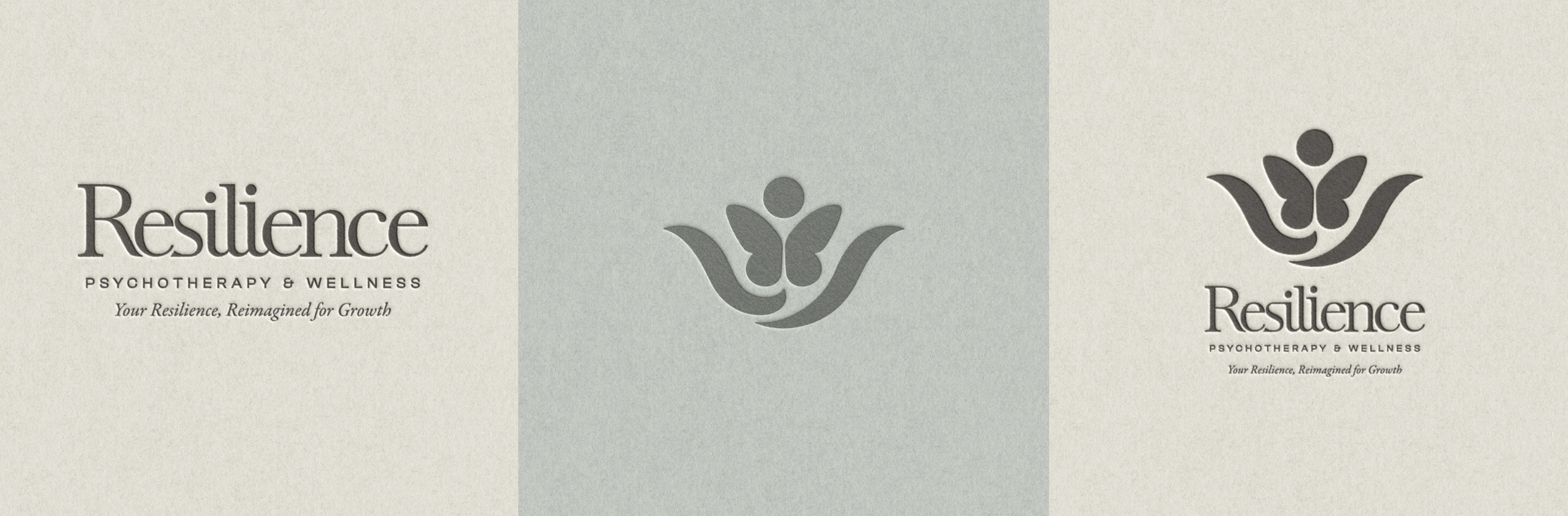
If you checked boxes from both lists, you may benefit from a combination logo that includes both your name and a symbol. Many businesses begin with a wordmark and later introduce an icon as their work expands. Others start with both and use them interchangeably depending on the context. The important part is that both elements feel consistent and aligned with your values.

Can You Have Both?
Many therapists, coaches, and wellness professionals eventually use both a wordmark and an icon. This approach offers flexibility and supports growth. A combination logo system allows you to choose the most effective expression of your brand for each context.
Why Use Both
- Flexibility across platforms: Your wordmark works well on your website, invoices, or professional documents where clarity is important. Your icon is effective in places where space is limited, such as Instagram profile images, app icons, or product packaging.
- Adaptability for growth: As your business expands, you may need both recognition of your name and the presence of a symbol. Using both prepares you for future offerings without needing to completely redesign your identity.
- Consistency with variation: A well-designed system ensures that your icon and wordmark feel connected. They can be used separately but still look like part of the same brand family.
Emotional Outcomes
Clients experience both professionalism and resonance. They see your name clearly when they want reassurance of who they are working with, and they recognize your icon when they encounter your products or online presence. Together, these elements create stability and recognition across every touchpoint.
Example
Think of Nike. The brand is instantly recognizable through both the word “Nike” and the swoosh symbol. Each can stand alone, but together they form a cohesive identity. For a wellness business, this could mean using your name as a wordmark on your website and pairing it with a simple symbol that represents your values on packaging or social media.
Combination logos are not required, but they are often a natural progression as a practice grows. Starting simple and adding layers later is a valid and sustainable path.
.png)
FAQs About Choosing a Brand Icon or Wordmark for Wellness Brands
How do I know if a brand icon or wordmark fits my stage of business?
If you are building a personal practice and want clients to remember your name, a wordmark logo is usually best. If you are creating products, launching group offerings, or planning to scale, a brand icon adds recognition and flexibility.
Will a brand icon or wordmark make my business look more professional?
Both are professional when designed with care. A wordmark communicates clarity and confidence through your name. A brand icon communicates identity through a symbol. The key is choosing the option that feels aligned with your values and the experience you want clients to have.
Can I start with a wordmark and add a brand icon later?
Yes. Many wellness professionals begin with a wordmark because it is simple and cost-effective. As your business expands into products, programs, or online platforms, you can add a brand icon to strengthen recognition without losing the consistency you’ve built.
Do I need both a brand icon and a wordmark from the beginning?
Not necessarily. A single, well-designed logo is enough at the start. Over time, some practitioners find it helpful to introduce a combination logo that uses both a wordmark and an icon. This allows you to adapt your branding across websites, packaging, and social media while keeping everything consistent.
How will my clients respond differently to a brand icon vs. a wordmark?
A wordmark helps clients feel they are connecting directly with you, which is important for therapists and coaches whose personal presence is central. A brand icon often creates faster recognition and works well when your offerings extend beyond personal services. Both approaches influence trust, but in different ways.
Is one type of logo better for building trust in wellness work?
Trust comes from alignment. If your brand centers on one-to-one relationships, a wordmark helps by making your name the focus. If your brand represents a broader mission, community, or product line, a brand icon helps express that vision. Choosing the style that matches your business goals will feel most trustworthy to your clients.

Choosing Between a Brand Icon or Wordmark With Clarity
Choosing between a brand icon or wordmark is less about rules and more about alignment. Both are effective. Both help you build recognition. The decision comes down to your business model, your values, and the way you want clients to feel when they encounter your brand.
If you are a therapist, coach, or spiritual wellness professional building a personal practice, a wordmark logo may support you best. It highlights your name and presence, creating trust and a sense of professionalism. If you are expanding into products, group programs, or digital platforms, a brand icon logo offers flexibility and instant recognition.
Some wellness businesses will eventually use both, creating a combination system that adapts across platforms while maintaining consistency. What matters most is that your choice feels steady and true to you.
Your logo is not the entirety of your brand, but it is a meaningful touchpoint. It communicates your care for detail, your intention, and the energy you bring to your work. When clients see your logo, they should feel the same sense of ease and trust they experience when working with you directly.
If you are still uncertain, spend time reflecting on this question: What do I want people to feel the moment they see my brand icon or wordmark? Your answer will guide your next step with clarity.
__________________________________________
Found this helpful? Pin it to your board so you can revisit these tips anytime! 📌