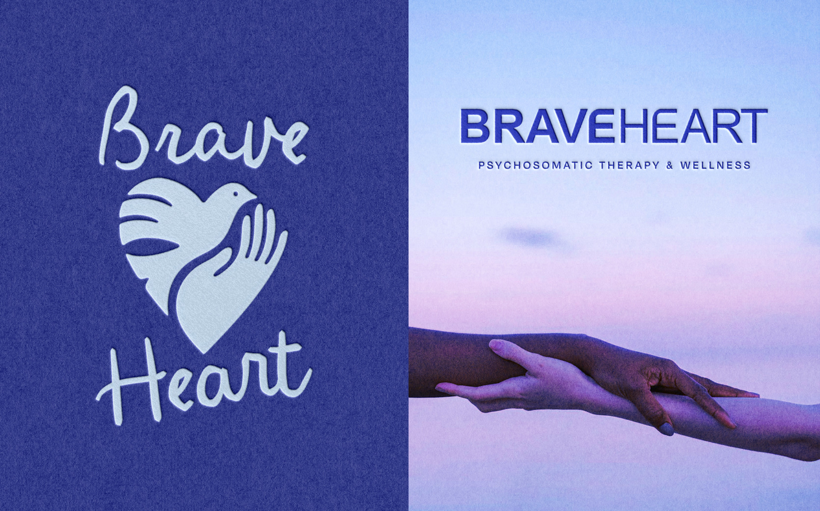
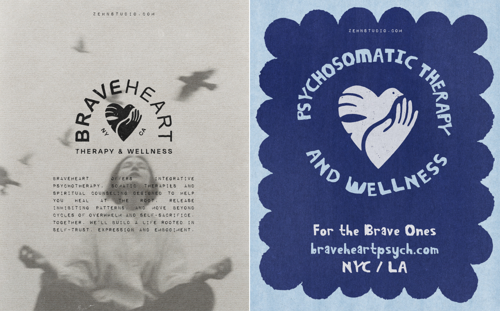
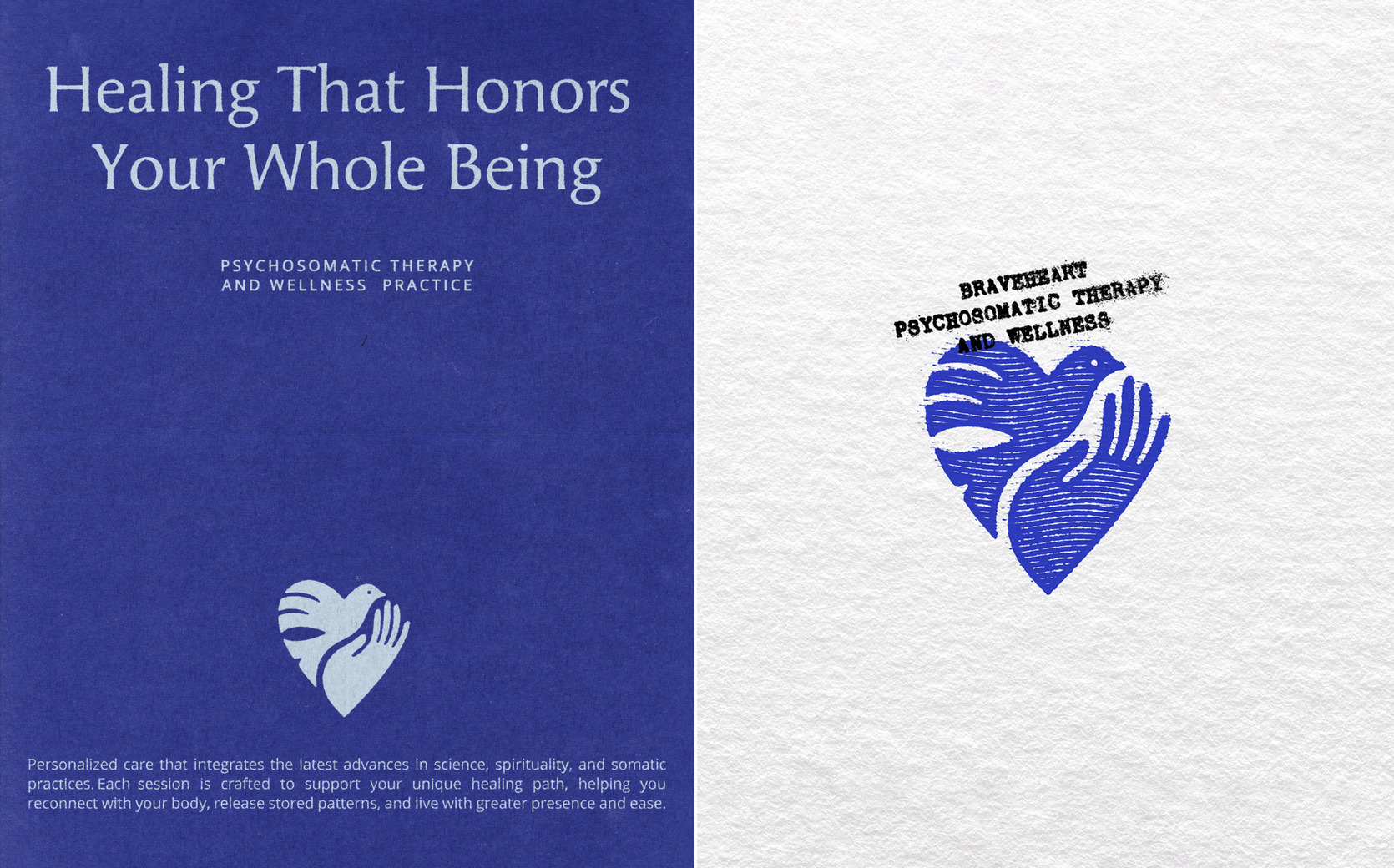
Vanessa came to us with a clear vision: to create a brand and website that fully reflected the depth, care, and transformation at the heart of her work. Her unique practice offers clients a deeply transformative journey through somatic healing, trauma recovery, and spiritual exploration — but she needed a visual identity and online presence that could hold that same emotional richness. We began by building a logo rich with layered meaning. A bird in mid-flight is gently cradled by an open hand, the two forming the shape of a heart. The bird speaks to liberation, motion, and spiritual awakening. The hand offers symbolism of care, presence, and release. And the heart serves as the emotional core — a return to compassion, truth, and inner knowing. Each element holds individual weight, but together they form a unified visual metaphor for BraveHeart’s purpose. The imagery symbolizes safety, empowerment, and transformation — a client’s journey from being held and supported to stepping into freedom and self-trust.
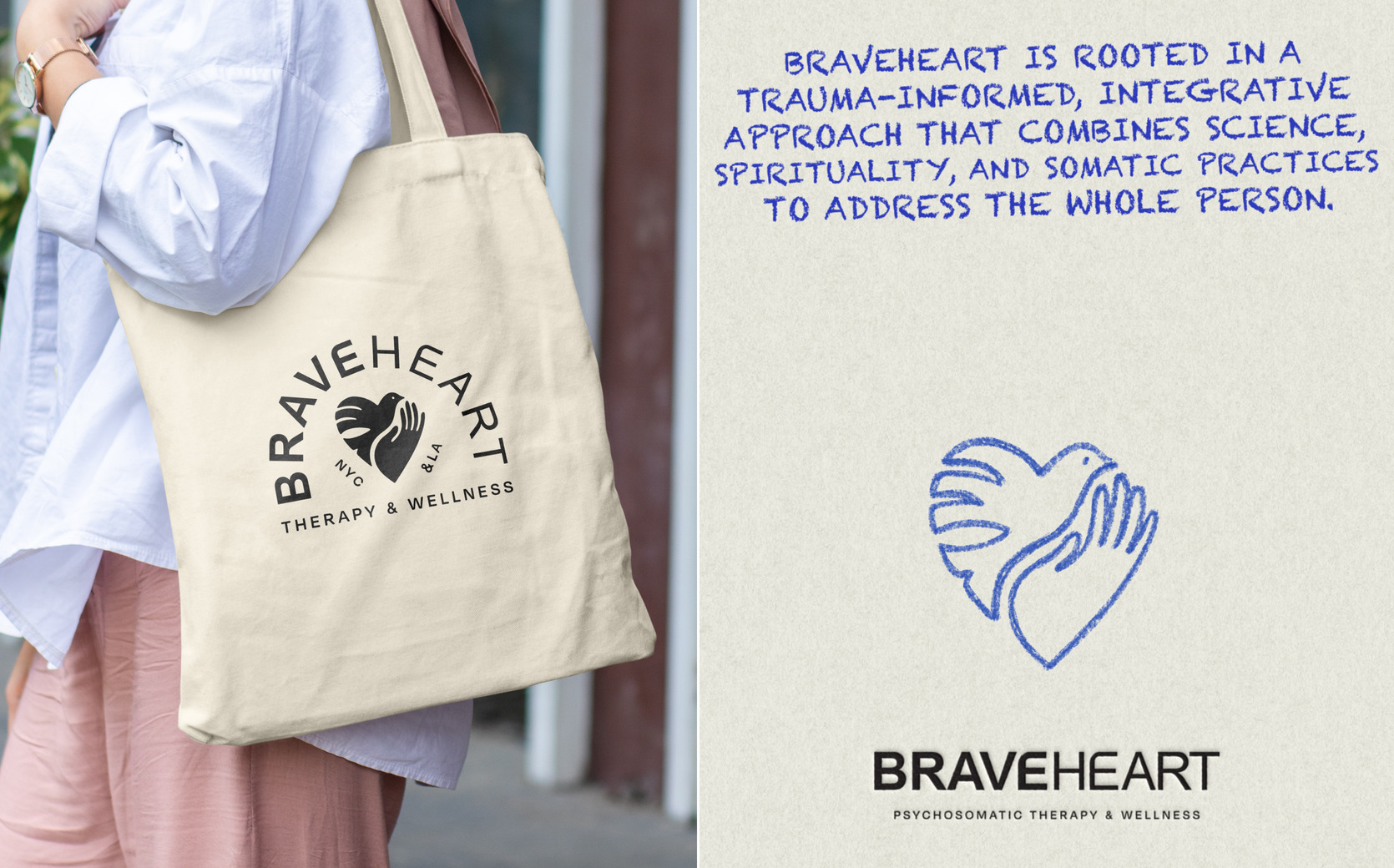
To complement the symbol, we crafted a custom wordmark that balances strength and warmth. The clean, sans-serif typography reinforces credibility and clarity, while subtle details like the distinctive “E” add a creative, human touch. The bold emphasis on the word “Brave” underscores the courage it takes to enter this kind of work, while the overall composition feels polished and approachable. Just as Vanessa’s practice is both structured and soulful, the branding reflects that same duality.
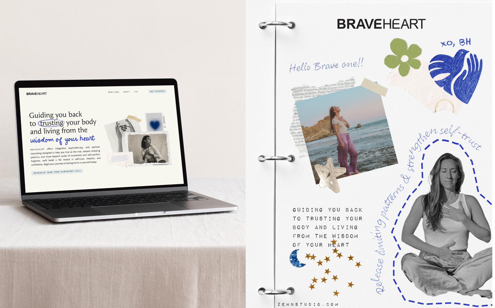
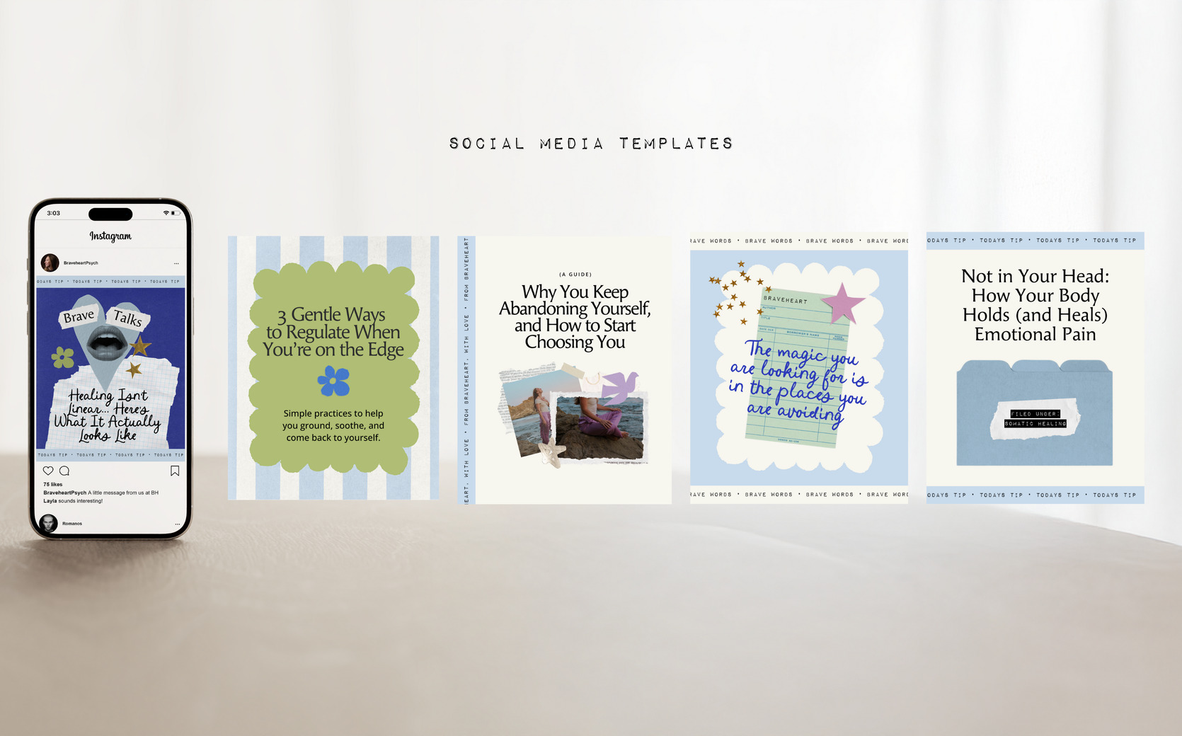
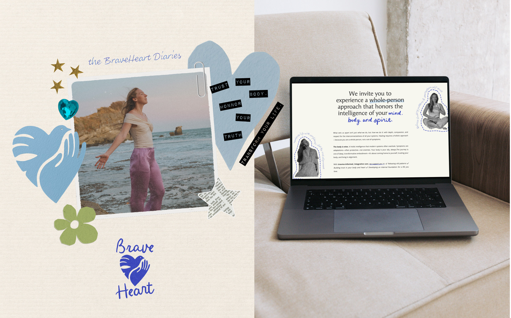
We carried this ethos into the website, designing a digital experience that feels like a personal journal — intimate, textured, and expressive. Collage-style visuals, layered elements, and handwritten-inspired fonts bring in a sense of artistry, while intentional page flows and clear navigation ensure accessibility. Every detail was crafted to build trust and reflect the BraveHeart journey.
